

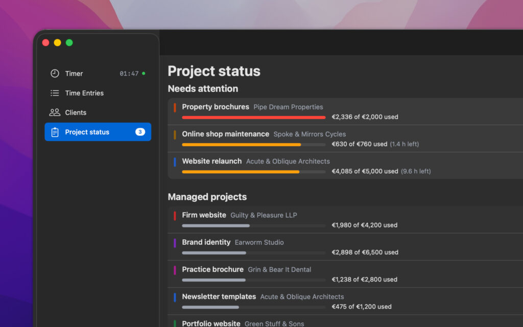
If you had asked me a year ago what would definitely not be included in Yokto, I would have answered without hesitation: colorful circles. Charts. Some page explaining how my month went using five different colors. For twenty years, I used trackers that advertised exactly those features—yet failed to get the most important part right.
Now, Yokto has a section called “Overview.” And honestly, that’s the reason I’m writing this text: I want to explain why, for me, this isn’t a contradiction.
The question that clean tracking doesn’t answer
“Clean tracking” means knowing at the end of the day exactly what that day cost in terms of time. What it doesn’t tell me is whether the project as a whole is still on track.
And that is precisely the question that costs money in the daily life of a freelancer. A fixed-price relaunch. A monthly maintenance agreement for eight hours of work. A deadline that suddenly feels closer than expected. You put in the time, categorize it neatly, and record everything correctly—yet no one notices that the original cost estimate no longer adds up.
The issue only comes to light when the invoice is sent. And by then, it’s too late. You can discuss additional work while the project is ongoing; after the fact, it’s no longer a mutual agreement—it’s an argument. I’m not talking about squeezing out more money. I’m talking about both sides knowing where they stand before the invoice arrives.
The usual workarounds are a spreadsheet alongside the tracker—which no one bothers to update after three weeks—or a project management tool that suits a solo freelancer about as well as a semi-truck suits a weekend grocery run. I’ve tried both. Neither lasted.
My current approach
I assign an hourly rate to each client. If a project deviates from that—say, travel time billed at a reduced rate—then the specific rate for that project is set accordingly. Then add a budget, an end date, or both. There are no other fields, and that’s by design.
After that, I don’t do anything else. I track my time just as I always have. The difference is that now I notice when a project is getting tight—the overview at the top lists projects needing attention, while those running smoothly appear below. Four-fifths of the budget used, a thousand euros left, end date in sight. One bar, one number, one date.
And that’s the point where I made peace with it: The tool doesn’t answer questions about the past month. It answers one about the days ahead. There’s no graph, no trend line, no pie chart showing me how much time I took for breaks. For me, that’s the crucial difference between something you just look at and something that leads to a decision.
A detail that pleases me more than it might seem
Yokto records the hourly rate for every saved entry. If I raise my rates in May, the figures from March remain exactly as they were.
That sounds like a minor detail—until things go wrong. Anyone who has issued an invoice and subsequently raised their rates knows that moment when old figures suddenly no longer match invoices that were sent out long ago. Done is done. Software shouldn’t go back and recalculate those numbers.
The same applies to project completion: projects don’t end with a single click. After the final invoice, there might be a coordination meeting, a forgotten entry, or some minor follow-up work. When I close a project in Yokto, it disappears from the overview—but I can still log time to it. It only vanishes completely once I archive it.
And still, no colorful pie charts
I don’t think this makes me better at estimating costs. I’ve calculated my hourly rate incorrectly for long enough to be wary of making a claim like that.
What has changed is the timing. I see things in the middle of the project that I used to only see at the end. That’s enough for me.